Meet the Designer: Amy Studebaker, Amy Studebaker Design
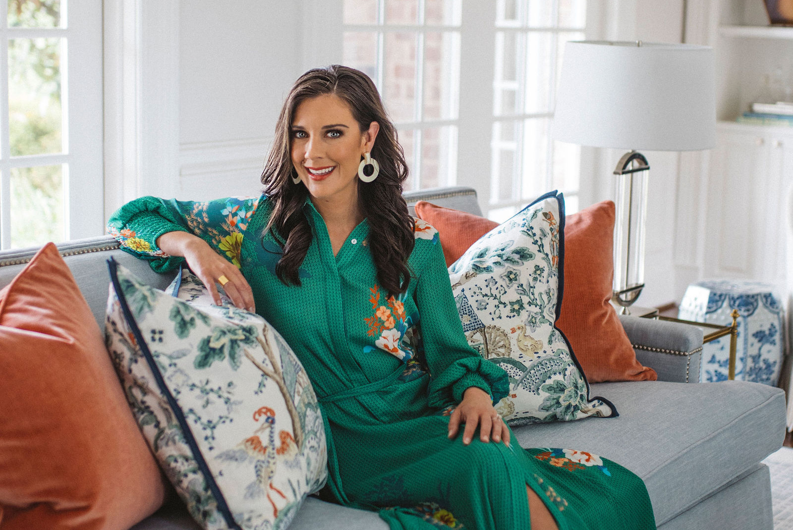
Forget fusty chintz and dusty doilies, and welcome chic chinoiserie and bold color pairings. Designer Amy Studebaker, owner of her eponymous firm in St. Louis, is reinventing traditional style. We spoke with Studebaker, on how she’s bringing verve and vibrancy to an old-school aesthetic.
How would you define your style?
I have a strong love of antiques and history, and I pull a lot of those elements into my projects. Though I focus on the clients’ style and needs, we always bring in a mix of new and old, because I feel that adds warmth and character to a home and creates a welcoming, collected feel. I like the phrase “The magic is in the mix.”
How does that play into your locale?
St. Louis has always had a more traditional look, but the local younger generation no longer wants their parents’ or grandparents’ versions of traditional. Traditional design is still reflected in our clients’ homes, but in a much lighter way that usually combines green, blue and white hues. Antiques are brought in as an homage to family traditions that we then pair with brightly colored furniture pieces, whether that means an accent table with raffia trim or a very clean, simple apron on tables. We find that the simplicity lies within the details.
You seem to enjoy patterns and textures.
Many types of patterns and textures are explored in our studio when trying to find fabrics that are right for a particular client. One of our current projects involves a mountain home, so a lot of fabric choices for that client involve layering tanned hides with wool plaids, leather, velvet and even shearling-type fringes on accent pillows. For more elegant projects, especially ones that involve some of the great historical homes in the St. Louis area, we might select more natural linens and pretty-patterned cottons.
Wallpaper also shines, like in this office?
The client wanted a tucked-away office, so we used a closet in her sitting room. We found the wallpaper first, with its very fun oversized scale that would jump out when she opened those doors, then worked from there. We pulled the desk color from the wallpaper, then used that reddish hot pink from the floral to trim the doors and casework as a bold statement.
Can you describe your approach to this sitting room?
Because this was a client’s pool house, we chose fresh and bright colors for the design: blues, pinks, oranges and greens. They’re all pretty intense colors with similar levels of saturation, so they complement each other and blend nicely to make that a bright, fun space. I always love mixing textures when I am creating a client’s space. We added shiplap on walls and grasscloth layers in the pagoda display case, as well as a large-scale woven basket on the coffee table.
Seems like you’re drawn to unexpected color pairings.
For this guest bedroom, we wanted a design that combined both fun and femininity in a fresh new way. We found this pineapple wallpaper which is bound to make any room stand out with its strong greens and pinks. Then we added the side tables which we had upholstered in a very soft, blue leather. Overall, I think it’s really about presenting the right scale and color and seeing how they work together in a space.